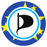
European Pirates logo selection process
As agreed by the European pirate parties gathered at Warsaw, the six submitted logos that best comply with technical criteria have been selected by the committee of professional creatives. Below you can find the six logos with their scoring, their submitted corporate image manual, and some of the criticisms of the committee.
On the following weeks, each founding ordinary member of the European Pirates will deliberate and choose its three favourite logos from these proposals, giving them 3, 2, and 1 points (and, thus, 0 to the other three). And the total points given to each proposal will then be added in the Founding Conference, where the European Pirates will adopt the proposal that obtained more points.
IMPORTANT: Please, do NOT use these logos. First, the proposals belong to their authors, who may not necessarily want to release their rights. Second, using multiple logos is not good for branding. Third, it is unfair to the rest of the proposals to start using one of them before the votes are cast. And fourth, the winner logo will have to work with the four official names of the organisation: European Pirates, PIRATES (its abbreviation), European Pirate Party, and PPEU (its abbreviation) so, even if it's the winner, some of them may need further work before they can be used.
| Scoring | Logo | Manual | Criticisms | |
| A | 10 points |  | Manual | Reminds of the European Union, but has it’s own character. The Stars are dynamic, almost exploding. Very nice use of typography here, overall, a very balanced logo. Good to use on photographs. Delivers the message with a very elegant style. Perfect finish. Too similar to the original logo when used toghether. Colour might be too classic. |
| B | 9 points |  | Manual | While the “European Pirates” is not readable, the visual language is nice, with bold letters. The Pirate sail forming an e with the circle doesn’t work that well, though. Easy to identify, good complement of national pirate party logos. Clear and well finished. “EU”, if read as an acronym, might be misleading (just like the stars in other logos). Good alternative to the stars, although the readability is low. |
| C | 8 points | 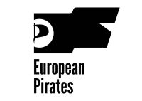 | Manual | Too many elements (sail, flag, star), and putting a sail on a flag is not convincing. But it looks good. Would have been better with some colour. The Font might be hard to read. Appealing. Would work well in conjunction with the original logo. The lack of colour makes it a bit too cold. Well balanced, and it is nice not to see an evident star. Having two flags is weird. |
| D | 5 points | 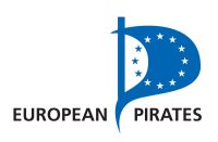 | Manual | It’s ok, but would have been better with more colour. Could lose itself on photographs. Concise and elegant use of the two predictable elements. It does not add much novelty, but would work well. |
| E | 4 points |  | Manual | The more conservative version of the 10 Points logo. Beautiful styleguide. Good to use on photographs. Predictable. Correct but not attractive. |
| F | 4 points | 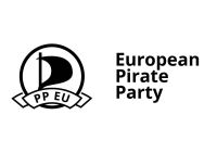 | Manual | Minimalist in a positive way. Space for acronym does not allow many variations. Does not add the idea of Europe to the original logo. Too plain. |
Here you can find the call and regulations that were used for this selection process.
And here you can find the results.
